By Janet Hopkins
Ever since the first websites demonstrated the power of aesthetics, the web continues to experience surges of new creative ideas. In waves, every couple of years, we have been noticing specific patterns and trends rising in popularity, only to be replaced with something fresh after a while. From the early ’90s, where only major companies had websites, the popularity of this media exponentially expanded. Fast forward to today, and every small business and every writer, designer, influencer, and others have their own versions of websites. As a result, it led to incredible competition for visibility, visitors, and ranking positions in search engines. But only those who follow the latest web design trends manage to stay on top.
Web design trends that will be popular in 2022
We live in a digital age where having a well-designed website is becoming a necessity. Often, it’s the only way for some businesses to reach their valuable viewers. However, modern web designs go far beyond just aesthetics. Especially today, where prominent search engines place the focus on user experience. That’s why it becomes crucial to combine design with website functionality and allow visitors to have a memorable browsing experience. If you want your website performance to improve in the future, there are a few web design trends you should be ready for in 2022:
- Bright and bold colors
- Design that manifests performance
- White space medley
- Outdoor hunger
- Interactive and customizable web design
1. Bright and bold colors
For a while, neutral minimalism was the name of the game. A simple website layout with fewer elements that “looks” more professional. With such a design, navigation is easy to understand and follow. And there was a minimum amount of screen objects that would cause a distraction for viewers.
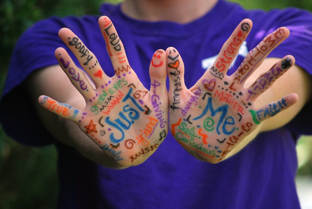
However, it seems like vibrant colors and bold combinations are coming back in a big way in 2022. All the previously awkward combinations that were primarily used for advertising purposes are now finding their place everywhere. Of course, it won’t go to the extreme. Considering it can be hard to match font and background colors that satisfy the WCAG 2.1 standard, it has to be a more discrete combination. But, what was once used to design CTA buttons and other distinctive elements is now becoming a trend.
One of the probable reasons for this trend is that people grew tired of “corporal neutrality”. Especially lately, due to the recent not-so-pleasant global events. They want to see more colorful content that will spark positive emotions while they are on the web.

2. Design that manifests performance
Fast loading times and satisfying page speeds are some of the prerequisites for a good user experience, especially since Google introduced their update that favors performing websites for rankings over slow and clumsy ones. This means that now more than ever, speed will be crucial for UX and SEO.
In other words, anything longer than 2-3 seconds will drive your visitors and search engines away, which will directly impact success if you are managing and maintaining a business website. You will need to cover all steps of the website designing process properly and ensure nothing slows your website down. From images to video and every element on the page, everything will have to be fully optimized for performance.
3. White space medley
Colorful websites are not the only type people are expecting to see in the future. We have all seen a variety of websites that are simply overcluttered. While elements are not placed randomly, sometimes it just feels like it. Many websites that want to accomplish too much end up with:
- Too much content on a single page
- Text that is not properly formatted
- Unnecessary elements that are occupying the white space
- Difficulties in finding information with such an interface
- Wrong use of colors for fonts and background
- and many more
However, what websites should actually have is quite the opposite. Visitors want to have some space while focusing on their search and reading. They don’t want to be additionally stressed, feeling restrained with distractions. To avoid this in 2022, focus on a clean design that leverages the use of white space. Let the main subject of the page be the only element in focus. This will be particularly useful since less clutter also means faster loading and better performance of a website.

4. Outdoor hunger
Again, recent events have left many people with an increased desire for traveling and outdoor activities. Now more than ever, people genuinely miss the opportunity to go outside and explore, hike, play, or simply spend some time relaxing in nature. This is reflected in web design trends through the rising popularity of websites that use natural and landscape motives. Generally speaking, this design uses a variety of themes based on calm and neutral colors, images, and tones. It makes visitors feel less constrained and initiates a sense of tranquility while browsing the pages.

5. Interactive and customizable web design
The way we use websites is constantly changing. Before we got to use the “mouse,” we had to rely only on the keyboard. But today, you can access and navigate websites in a variety of ways. For example, people with visual impairments do it quite successfully with voice technology. And that is only one example of how interactivity can come in different shapes.
On the other hand, business websites vastly implement different on-site chat technologies where you can directly speak with designated agents. In addition, web design layouts allow you to manipulate the pages in creative ways, not only by scrolling down the page and clicking on buttons. Finally, the possibility for visitors to customize the whole appearance of the pages they often visit is just a cherry on top. This designing approach can help you accomplish several things at the same time:
- Makes websites more interesting
- Makes it possible for everyone to use them
- Allows a bit of control to the users
- Allows everyone to configure the layout according to their preferences
- Has strong support from search engines due to increased accessibility and usability
Everything on the web constantly changes, including web design trends. Something that was once popular and considered modern, tomorrow will be a remnant of the past. While some trends are not exactly new, they are given a chance to evolve until their time arrives. Given these points, every website owner should be prepared to at least consider the possibility of adjusting to the new web design trends in 2022.
Author Bio: Janet Hopkins has years of experience working as a graphical and web designer. Today, she mostly deals with writing and offering creative advice to WP Full Care and other websites that focus on design and development. During her time off, she enjoys taking long strolls through nature where she can find additional inspiration.


